When you think about what makes a great website, you might first think of things like content, speed, mobile-friendliness, or SEO.
But one often underestimated — yet incredibly powerful — factor is color.
Colors aren’t just decoration.
Colors impact how people feel, what they think, and whether they trust and engage with your brand.
The right color choices can increase conversions, keep visitors longer, and build strong emotional connections.
The wrong ones? They can quietly drive visitors away without you even realizing it.
Let’s explore how colors influence websites, the psychology behind them, and how you can use color strategically to boost your success online.
Why Color Matters in Website Design
Color plays a critical role in first impressions.
Studies show that:
- People form an opinion about a product, brand, or website within 50 milliseconds.
- Up to 90% of snap judgments about products can be based on color alone.
In web design, color affects:
- Mood and emotions
- Perceived professionalism
- Brand recognition
- Readability and usability
- Conversion rates (sales, sign-ups, downloads)
In short: color is not just “how your site looks.”
It’s “how your site feels” — and that feeling drives behavior.
The Psychology of Color: What Different Colors Communicate
Different colors trigger different emotions and associations.
Understanding this helps you pick colors that align with your brand message and website goals.
Here’s a breakdown:
| Color | Common Associations | Typical Use |
|---|---|---|
| Red | Energy, excitement, urgency, passion, action | Clearance sales, call-to-action buttons |
| Blue | Trust, calm, security, professionalism | Banks, healthcare, corporate websites |
| Green | Health, growth, balance, nature, wealth | Organic brands, finance, environment |
| Yellow | Optimism, happiness, warmth, caution | Highlighting deals, youthful brands |
| Orange | Enthusiasm, creativity, friendliness, fun | Tech startups, e-commerce |
| Purple | Luxury, creativity, wisdom, spirituality | Beauty products, premium services |
| Black | Power, elegance, sophistication, exclusivity | Luxury brands, fashion sites |
| White | Purity, simplicity, cleanliness, modernity | Minimalist websites, portfolios |
| Gray | Neutrality, balance, calm, sophistication | Backgrounds, tech brands |
Tip:
Context matters.
For example, red can mean passion in a dating app — but danger if misused on a healthcare site.
How to Use Color Strategically on Your Website
Choosing the right colors is both an art and a science.
Here’s how to use color intentionally, not randomly:
✔ 1. Align Colors With Your Brand Identity
Your website colors should reflect your brand’s core values and message.
Examples:
- A law firm might choose blue and gray (trust and professionalism).
- A toy store might choose bright yellow and red (fun and excitement).
- A luxury skincare brand might choose purple and gold (elegance and exclusivity).
Ask yourself:
- What emotions do I want people to feel when they visit my site?
- How do I want to be perceived?
✔ 2. Limit Your Color Palette
Using too many colors can overwhelm visitors.
The best websites typically stick to 2 to 4 main colors.
A typical palette includes:
- Primary color (main brand color)
- Secondary color (supports the primary)
- Accent color (for buttons, highlights)
- Background color (usually neutral, like white or light gray)
This creates visual consistency and makes your site look more polished.
✔ 3. Use Contrast for Readability
No matter how beautiful your color scheme is, if users can’t read your text, it’s useless.
High contrast = better readability.
Examples:
- Dark text on a light background (black on white) is easiest to read.
- Light text on a dark background can work but requires careful font choices and larger text sizes.
Accessibility tip:
Aim for at least a 4.5:1 contrast ratio between text and background colors to meet web accessibility standards (WCAG guidelines).
✔ 4. Guide User Actions With Color
Strategically use color to draw attention where you want it.
Examples:
- Use a bright, contrasting color for your Call-to-Action (CTA) buttons like “Buy Now” or “Sign Up.”
- Use different shades to guide people’s eyes through your page layout.
- Highlight important information (sales, alerts, discounts) with bold colors like red or orange.
Color isn’t just about beauty — it’s about directing behavior.
✔ 5. Be Culturally Aware
Colors can have different meanings across cultures.
Examples:
- In Western cultures, white represents purity (weddings).
In some Asian cultures, white is associated with mourning (funerals). - Red symbolizes luck and prosperity in China but can indicate danger in the U.S.
If your website has an international audience, research cultural color meanings carefully.
Examples of Color in Action: Famous Brands
Major brands carefully craft their colors to match their identity:
- Facebook: Blue — trust, calm, connection
- Coca-Cola: Red — excitement, passion, energy
- Starbucks: Green — growth, freshness, health
- Apple: White, gray, black — simplicity, sophistication, modernity
- McDonald’s: Red and yellow — excitement and hunger (and quick decisions)
Notice how consistent their color use is across websites, apps, ads, and packaging.
Consistency builds recognition and loyalty.
How to Choose the Right Color Palette for Your Website
Here’s a simple step-by-step guide:
1. Start With Your Brand Colors
If you already have a logo, start there.
Use those colors to anchor your website design.
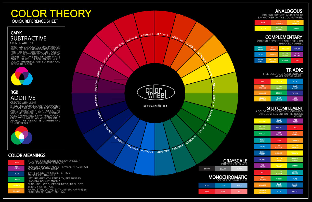
2. Use Color Theory Tools
Helpful tools:
- Coolors — generates color schemes
- Adobe Color — explore harmonies based on color theory
- Canva Color Palette Generator
Look for:
- Complementary colors (opposites on the color wheel)
- Analogous colors (next to each other on the wheel)
- Triadic colors (three evenly spaced colors)
3. Test Your Choices
Mock up different combinations.
See how they feel.
Ask others for feedback.
Prioritize clarity, emotion, and functionality over personal preference.
Common Color Mistakes to Avoid
- ❌ Using too many clashing colors
- ❌ Poor contrast between text and background
- ❌ Ignoring colorblind accessibility
- ❌ Inconsistent colors across pages
- ❌ Forgetting to test colors on mobile devices
Remember: Simple, strategic use of color almost always beats complicated designs.
Final Thoughts: Color Is the Secret Language of Great Websites
You could have the best content, fastest site, and slickest technology — but if your colors are wrong, people may leave without even realizing why.
Color creates instant emotional responses.
It builds trust.
It guides behavior.
It defines your brand.
When used wisely, color is one of the most powerful — and affordable — tools you have to boost your website’s success.
Take the time to choose your colors carefully.
Think about the feelings you want to create, not just the aesthetics.
Because when it comes to websites, it’s not just what people see —
it’s what they feel that matters most.